POWERPOINT PRESENTATIONS
The initial PowerPoint Presentation comprises a series of pages derived from a selection of key elements from the Healthcare Professional (HCP) Core Sales Aid. The presentation commences by providing an overview of the demographics of the MOXIe Trial study group. Subsequently, it delves into details regarding the trial's duration, including its extended phase, and presents the outcomes of the drug compared to a placebo. It is presumed that the audience possesses familiarity with mFARS scoring, enabling the presentation to proceed to tout the drug's benefits. This is accomplished through the incorporation of various charts indicating that, in patients in the early stages of the disease, the drug may effectively impede disease progression for several years. The visual design of the PowerPoint very closely adheres to the distinctive look, feel, and tone established by the brand style guide implemented by my team for the core campaign.
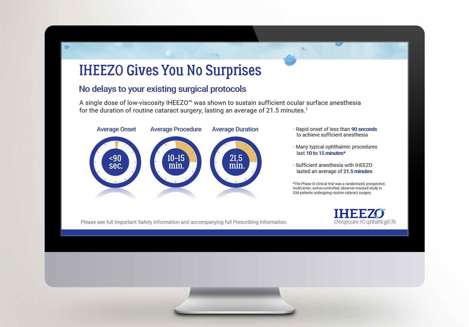
The second PowerPoint Presentation strategically uses the trademark "O" as the focal point on the cover, emphasizing its significance. This presentation coincides with the drug's launch phase, aiming to create a “splash” with visual impact, pun intended. Content-wise, much of the material is drawn from the brand's Healthcare Professional Core Sales Aid. The overarching theme of “IHEEZO gives you nothing” is consistently reinforced across the three main sections: details about the drug, dosing information, and the Important Safety Information (ISI). The essence of IHEEZO delivering everything needed for effective sales is succinctly encapsulated on page 3. Its rapid and long-lasting effectiveness, requiring minimal reapplication, underscores its user-friendly nature. Furthermore, the visual design aligns seamlessly with the distinctive look, feel, and tone prescribed by the brand style guide meticulously implemented by our team for the core campaign.


